Form components
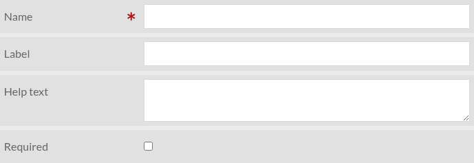
Form components are the building blocks of a form. Several types of component exist. Most types share the following subset of parameters:
- Name
This should be a unique identifier of the form component. It will be used as the HTML element’s
nameattribute value.- Label
The text that will be displayed in front of the form element
- Help text
A more detailed description of the form element and what is expected from the user. It should be displayed next to the label, but depending on the theme used it could be different.
- Required
Required form components prevent the form to be submitted if they are empty (not set).
For parameters specific to a form component type, see below.
Checkbox
A simple checkbox that is unchecked by default.
Settings

Dropdown list
A dropdown list, whose options can be set manually or be retrieved from a “Custom Vocab” vocabulary
Settings
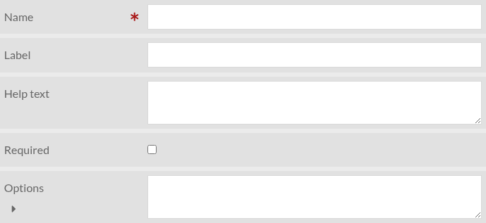
- Options
A list of options, one per line
- Custom Vocab
This parameter is visible only if Custom Vocab module is enabled. If set, the “Options” parameter is ignored.
File upload
Allow user to upload files
Settings
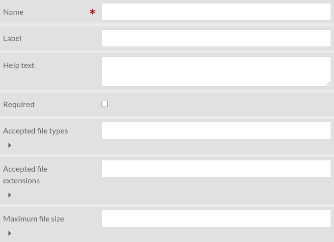
- Accepted file types
A comma-separated list of accepted file types. If empty, all file types are accepted.
- Accepted file extensions
A comma-separated list of accepted file extensions. If empty, all file extensions are accepted.
- Maximum file size
Maximum file size in bytes or in SI notation. For instance “10485760” or “10MB”.
HTML
This component type allow to add arbitrary HTML in the form
Settings
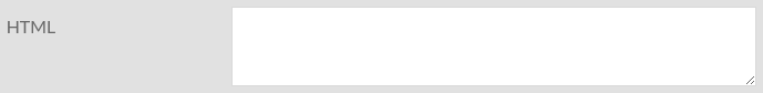
- HTML
The HTML code to be added to the form. A WYSIWYG editor is available.
Recaptcha (antispam)
Prevent spam with reCAPTCHA (Google). Requires “reCAPTCHA site key” and “reCAPTCHA secret key” to be set (see security settings)
Settings

Text area
A multi-line text input
Settings

Text input
A simple text input
Settings

User e-mail address
This is like “Text input” but is automatically set to user’s email if user is authenticated.
Settings